
 Search
6 Text Effects For Photoshop
Page 1 of 1 • Share


- kirk
 Beta Tester
- Forum Posts : 11
Member Since : 2011-11-06
 kirk 7/11/2011, 2:07 pm
This has been around for a while now and you can find it on many graphic websites, for beginners this is a great way to learn a few things, and keep in mind you can still play around and adjust things to your own liking as well.
Not sure who originally came up with this tutorial, But would like to give credit and special thanx to them for a great tutorial and great share. I remember when i first started this helped me a lot and opened the doors on leaning more for doing text.
Quick Gold Text

There are a lot of ways to make “gold” text. This one makes use of two layers with the exact same text on it. They are layered on top of each other with the bottom layer a few pixels down so that it gives an illusion of 3 dimenions.
The font we’re using here is Trajan—a very elegant typeface that suits gold text.
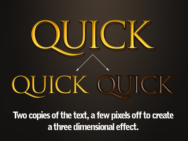
First the top layer, which is made with the usual suspects—a bevel, a gradient overlay, and so on. Note the faint drop shadow that actually gets applied to the layer below it (which then has its own drop shadow).


There are a lot of ways to make “gold” text. This one makes use of two layers.
Not sure who originally came up with this tutorial, But would like to give credit and special thanx to them for a great tutorial and great share. I remember when i first started this helped me a lot and opened the doors on leaning more for doing text.
Quick Gold Text
There are a lot of ways to make “gold” text. This one makes use of two layers with the exact same text on it. They are layered on top of each other with the bottom layer a few pixels down so that it gives an illusion of 3 dimenions.
The font we’re using here is Trajan—a very elegant typeface that suits gold text.
First the top layer, which is made with the usual suspects—a bevel, a gradient overlay, and so on. Note the faint drop shadow that actually gets applied to the layer below it (which then has its own drop shadow).
There are a lot of ways to make “gold” text. This one makes use of two layers.
Last edited by kirk on 7/11/2011, 3:04 pm; edited 4 times in total
- kirkBeta Tester
- Forum Posts : 11
Member Since : 2011-11-06
kirk 7/11/2011, 2:14 pm
3D Metallic Text

This effect is actually just a variation on the gold text. As you can see below, we’ve again used the dual copies of the text, each with layer styles applied. Here I used a different Gloss Contour on the beveled text below, and of course everywhere we used a yellow shade in the last effect, I used a grey color here.
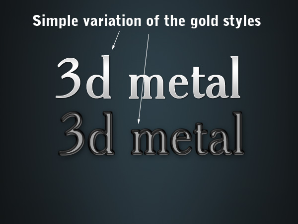
To try something slightly different, I also applied a text warp. You can do this by clicking on to the text layer, selecting the Horizontal Type Tool (T) and then an icon appears at the top (shown below) that you click on. This gives the Warp Text dialog box.
Now if you apply a Bulge to one of the layers, but not the other, you get a slight distortion that looks neat.


This effect is actually just a variation on the gold text. As you can see below, we’ve again used the dual copies of the text, each with layer styles applied. Here I used a different Gloss Contour on the beveled text below, and of course everywhere we used a yellow shade in the last effect, I used a grey color here.
To try something slightly different, I also applied a text warp. You can do this by clicking on to the text layer, selecting the Horizontal Type Tool (T) and then an icon appears at the top (shown below) that you click on. This gives the Warp Text dialog box.
Now if you apply a Bulge to one of the layers, but not the other, you get a slight distortion that looks neat.
Last edited by kirk on 7/11/2011, 2:34 pm; edited 1 time in total
- kirkBeta Tester
- Forum Posts : 11
Member Since : 2011-11-06
kirk 7/11/2011, 2:20 pm
DoubleType

This effect is much simpler and just relies on having two versions of the text, one styled and one not. I’ve used Futura as my typeface here. I believe I saw this effect on a movie poster once so I’ve used red the way they did, but it works just as well with other colors and combinations.
All there is to do is apply two bits of layer styling:
1. Add a 1px Outer Stroke using a gradient instead of a color. I’ve used one of Photoshop’s metallic gradients (see the thin metal style further down for more details). It gives the edges a shiny quality that’s nice.
2. Then we add a black to white Gradient Overlay to the text set to Overlay and 50%. This means when you change the text color it automatically adjusts so it has a nice bit of shading over the top.

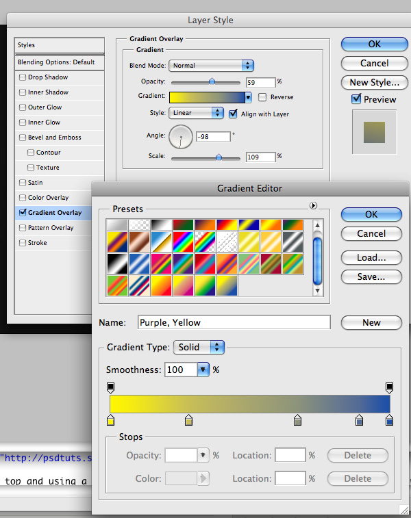
HyperColor

This effect I discovered at Chris Garrett Media‘s site where he uses it to great effect. It’s a very simple effect really, you just grab some text (typeface is DIN in this example) and give it a Gradient Overlay. Photoshop has some really nice Color Harmony gradients that you can add by clicking on that little arrow that points to the right on the Gradient Editor dialog box. The gradients it adds are the bunch at the bottom. If you choose one of those and set it to about 59% on white text, set on a dark background.
This effect is much simpler and just relies on having two versions of the text, one styled and one not. I’ve used Futura as my typeface here. I believe I saw this effect on a movie poster once so I’ve used red the way they did, but it works just as well with other colors and combinations.
All there is to do is apply two bits of layer styling:
1. Add a 1px Outer Stroke using a gradient instead of a color. I’ve used one of Photoshop’s metallic gradients (see the thin metal style further down for more details). It gives the edges a shiny quality that’s nice.
2. Then we add a black to white Gradient Overlay to the text set to Overlay and 50%. This means when you change the text color it automatically adjusts so it has a nice bit of shading over the top.
HyperColor
This effect I discovered at Chris Garrett Media‘s site where he uses it to great effect. It’s a very simple effect really, you just grab some text (typeface is DIN in this example) and give it a Gradient Overlay. Photoshop has some really nice Color Harmony gradients that you can add by clicking on that little arrow that points to the right on the Gradient Editor dialog box. The gradients it adds are the bunch at the bottom. If you choose one of those and set it to about 59% on white text, set on a dark background.
- kirkBeta Tester
- Forum Posts : 11
Member Since : 2011-11-06
kirk 7/11/2011, 2:24 pm
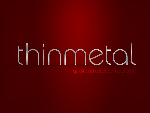
Thin Metal

This is the simplest way to make a metallic effect. It relies on the fact that when you see metal in real life, it’s usually got lots of highlights and shadows, especially shinier, chromier type metals. So by using two copies of the same gradient at different angles you can make this effect happen really easily and give your text a metallic effect.
It’s best on a thin typeface because otherwise the interior of the text looks dull and flat (unless of course we added more styling, but then it wouldn’t be super quick!)
So first of all I decided to make my text ‘stand up’ in this example. So just create a layer below your text and draw tiny circles of black below the points of each letter. Then blur them by going to Filters > Blur > Gaussian Blur and set it to about 2px. Then hit Ctrl+T and squash them vertically. Finally set them to about 30% Opacity so they are nice and faded out.
For letters like the a and e where there is a larger area of the letter touching the ‘floor’, you can use the transform tool to stretch the circle our horizontally.
Finally I duplicated one of my circle shadows and stretched it waay out so that it went underneath the whole bit of text to make the overall shadow.
Experiment and you should be able to create some neat little pools of shadow under the letters.

Now the actual text is just a combination of a Gradient Overlay and a 1px Stroke that uses the same gradient. The gradient we use (and it’s the same as in the Double Type effect above) is a metallic gradient that comes with Photoshop. You can add this to your gradients palette, using that little right arrow shown in the Gradient Editor below, then choose Metals and you should see it appear.
The key here is to make sure the Angle on the overlay and the stroke is different. This is what creates the highlights on the text that you can see in the close up screenshot above.
I also set the main overlay to just 14% Opacity over the top of some grey text so that it was a little faded out, but that’s optional.

This is the simplest way to make a metallic effect. It relies on the fact that when you see metal in real life, it’s usually got lots of highlights and shadows, especially shinier, chromier type metals. So by using two copies of the same gradient at different angles you can make this effect happen really easily and give your text a metallic effect.
It’s best on a thin typeface because otherwise the interior of the text looks dull and flat (unless of course we added more styling, but then it wouldn’t be super quick!)
So first of all I decided to make my text ‘stand up’ in this example. So just create a layer below your text and draw tiny circles of black below the points of each letter. Then blur them by going to Filters > Blur > Gaussian Blur and set it to about 2px. Then hit Ctrl+T and squash them vertically. Finally set them to about 30% Opacity so they are nice and faded out.
For letters like the a and e where there is a larger area of the letter touching the ‘floor’, you can use the transform tool to stretch the circle our horizontally.
Finally I duplicated one of my circle shadows and stretched it waay out so that it went underneath the whole bit of text to make the overall shadow.
Experiment and you should be able to create some neat little pools of shadow under the letters.
Now the actual text is just a combination of a Gradient Overlay and a 1px Stroke that uses the same gradient. The gradient we use (and it’s the same as in the Double Type effect above) is a metallic gradient that comes with Photoshop. You can add this to your gradients palette, using that little right arrow shown in the Gradient Editor below, then choose Metals and you should see it appear.
The key here is to make sure the Angle on the overlay and the stroke is different. This is what creates the highlights on the text that you can see in the close up screenshot above.
I also set the main overlay to just 14% Opacity over the top of some grey text so that it was a little faded out, but that’s optional.
- kirkBeta Tester
- Forum Posts : 11
Member Since : 2011-11-06
kirk 7/11/2011, 2:30 pm
Plastic Fantastic
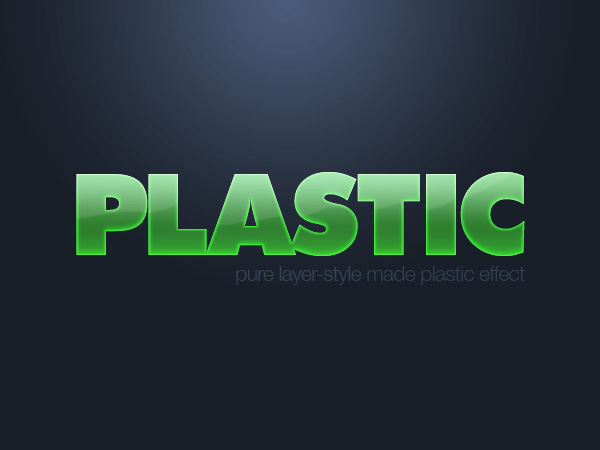
I love these gel-type text styles, though I must admit I don’t think I’ve ever actually used one in a real design. But who cares, they are so fun to make. This one uses two copies of the text and two different layer styles (similar to our first two metal texts earlier).
You can see the two layers below. The main styling is done in the bottom layer, while the top one is used to create that shine effect.
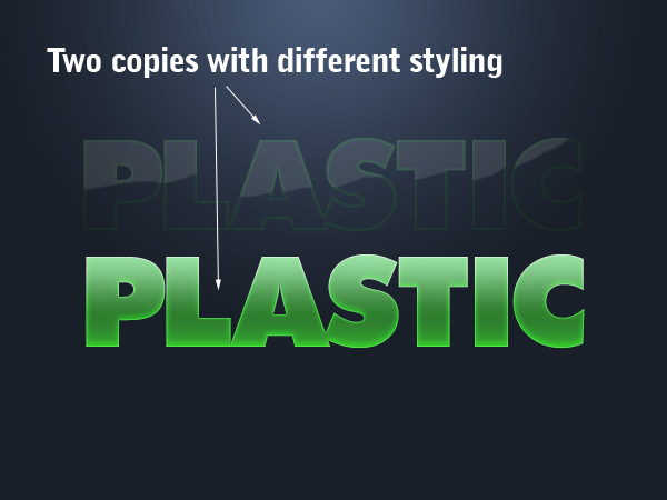
In the bottom layer we’ve used a bunch of glows, altered shadows, and gradient overlays. You can see the actual settings further below.


n this layer I’ve heavily modified a Bevel and Emboss style to create that sharp-edged highlight. Again, you can see the exact settings, including the shape of the gradient contour below.


I love these gel-type text styles, though I must admit I don’t think I’ve ever actually used one in a real design. But who cares, they are so fun to make. This one uses two copies of the text and two different layer styles (similar to our first two metal texts earlier).
You can see the two layers below. The main styling is done in the bottom layer, while the top one is used to create that shine effect.
In the bottom layer we’ve used a bunch of glows, altered shadows, and gradient overlays. You can see the actual settings further below.
n this layer I’ve heavily modified a Bevel and Emboss style to create that sharp-edged highlight. Again, you can see the exact settings, including the shape of the gradient contour below.
- bHulleT.w
 Beta Tester
 - Forum Posts : 11
Member Since : 2011-11-05 -

bHulleT.w 8/11/2011, 10:52 am
Good job kirk !
- Vanilla990
 Administrator
 - Forum Posts : 114
Member Since : 2011-10-30
Vanilla990 8/1/2012, 1:31 pm
Great tutorials 
I enjoyed going through the steps and creating the text and now I have some new knowledge I can put to use.
Thank you for the great tutorial and simple steps Kirk
I enjoyed going through the steps and creating the text and now I have some new knowledge I can put to use.
Thank you for the great tutorial and simple steps Kirk
- xiaomah01
 Member
- Forum Posts : 3
Member Since : 2011-12-30 -
xiaomah01 8/1/2012, 9:36 pm
Good job kirk  u are perfection
- Syfte
 Member
 - Forum Posts : 17
Member Since : 2012-02-15
Syfte 19/2/2012, 1:43 pm
These are great! If I only had PS xD
- YoshiGM
 Member
 - Forum Posts : 3
Member Since : 2012-03-12
YoshiGM 12/3/2012, 11:01 am
AWEsome !
I love the metal effect :O
I love the metal effect :O
- Coddy
 Member
 - Forum Posts : 45
Member Since : 2011-11-21
Coddy 18/3/2012, 11:38 am
These are great kirk. Good job man. 
- HyperActive

Banned
- Forum Posts : 42
Member Since : 2011-12-16
HyperActive 11/7/2012, 5:32 am
Very nice job
- BlackScorpion
 Design Expert
- Forum Posts : 7
Member Since : 2012-07-05
BlackScorpion 12/7/2012, 4:40 pm
Excellent tutorials, thanks for posting them. Now if only we can get some for Fireworks!?
- Sponsored content
Sponsored content

Similar topics
Create an account or log in to leave a reply
You need to be a member in order to leave a reply.
Page 1 of 1
Permissions in this forum:
You cannot reply to topics in this forum|
|
|